
My Robi - Offers, Usage, More
3.9star
450K reviews
10M+
Downloads

Everyone
info
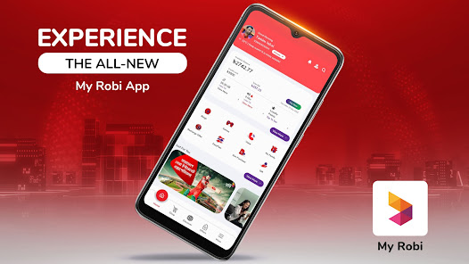

About this app
আপনার রবি সিম সংক্রান্ত সকল প্রয়োজন মেটাতে রয়েছে মাই রবি অ্যাপ! তাই কষ্ট করে আর কঠিন কোড মুখস্থ করা বা কল সেন্টারে অপেক্ষা করার আর প্রয়োজন নেই!
⏱️ রেডি থাকুন সবসময়!
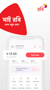
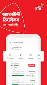
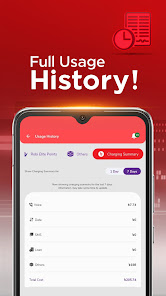
আপনার ব্যালেন্স ও হিস্ট্রি দেখুন এবং ব্যালেন্স ফুরিয়ে গেলে লোন নিন
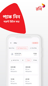
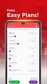
🧮 সাজিয়ে নিন নিজের মতো!
ইজিপ্ল্যান অপশন থেকে নিজের পছন্দমতো প্যাক বানিয়ে নিন
👪 খেয়াল রাখুন প্রিয়জনদেরও!
অ্যাপ থেকে সর্বোচ্চ ৫টি সেকেন্ডারি একাউন্ট ম্যানেজ করুন ও মাই ফ্যামিলি প্যাক কিনে শেয়ার করুন প্রিয়জনদের সাথে!
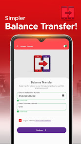
🎁 উপহার দিন দারুন কিছু!
নিজের পছন্দমতো প্যাক বানিয়ে প্রিয়জনদের গিফট করুন বা ব্যালেন্স ট্রান্সফার করুন
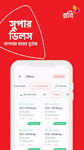
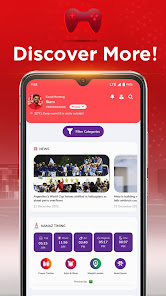
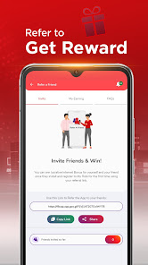
🏄 এক অ্যাপে অনেক কিছু!
নিউজ, গেমস, লাইভ স্পোর্টস, টিকেট, শপিং – যা প্রয়োজন সব আছে এই অ্যাপে!
এছাড়াও থাকছে
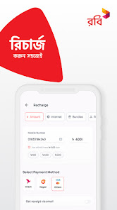
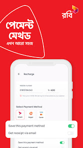
💳 মোবাইল রিচার্জ ও বিল পেমেন্ট
✂️ আকর্ষণীয় রেট কাটার
🎶 প্রিয়জনকে গান শোনান গুনগুন সার্ভিস দিয়ে
🏚️ ডোরস্টেপ সিম সার্ভিস
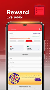
👑 রবি এলিট
✈️ রোমিং
💬 গ্রাহক সেবা
তাই দেরি না করে এখনই ডাউনলোড করুন মাই রবি অ্যাপ! 😊
⏱️ রেডি থাকুন সবসময়!
আপনার ব্যালেন্স ও হিস্ট্রি দেখুন এবং ব্যালেন্স ফুরিয়ে গেলে লোন নিন
🧮 সাজিয়ে নিন নিজের মতো!
ইজিপ্ল্যান অপশন থেকে নিজের পছন্দমতো প্যাক বানিয়ে নিন
👪 খেয়াল রাখুন প্রিয়জনদেরও!
অ্যাপ থেকে সর্বোচ্চ ৫টি সেকেন্ডারি একাউন্ট ম্যানেজ করুন ও মাই ফ্যামিলি প্যাক কিনে শেয়ার করুন প্রিয়জনদের সাথে!
🎁 উপহার দিন দারুন কিছু!
নিজের পছন্দমতো প্যাক বানিয়ে প্রিয়জনদের গিফট করুন বা ব্যালেন্স ট্রান্সফার করুন
🏄 এক অ্যাপে অনেক কিছু!
নিউজ, গেমস, লাইভ স্পোর্টস, টিকেট, শপিং – যা প্রয়োজন সব আছে এই অ্যাপে!
এছাড়াও থাকছে
💳 মোবাইল রিচার্জ ও বিল পেমেন্ট
✂️ আকর্ষণীয় রেট কাটার
🎶 প্রিয়জনকে গান শোনান গুনগুন সার্ভিস দিয়ে
🏚️ ডোরস্টেপ সিম সার্ভিস
👑 রবি এলিট
✈️ রোমিং
💬 গ্রাহক সেবা
তাই দেরি না করে এখনই ডাউনলোড করুন মাই রবি অ্যাপ! 😊
Updated on
Safety starts with understanding how developers collect and share your data. Data privacy and security practices may vary based on your use, region, and age. The developer provided this information and may update it over time.

No data shared with third parties
Learn more about how developers declare sharing

This app may collect these data types
Location, Personal info and 2 others

Data is encrypted in transit

You can request that data be deleted
Ratings and reviews
3.9
447K reviews

Sakib
- Flag inappropriate
June 8, 2024
While the UX is fine, the UI is cluttered with many unnecessary elements on top. Please make it simpler and cleaner, it's necessary. All essential options such as Balance, Internet, Minutes, Offers etc should be in the home section with a clean interface. Other options such as News, Entertainment, Ads etc should be in a separate menu, not in the home section. It's irritating to use the app with the current setup. Also you should add a dark mode, as it is necessary for such a vibrant app. Peace!
1 person found this review helpful
Robi Axiata Ltd
June 11, 2024
Dear Sakib, thank you for your valuable feedback. You can also let us know your suggestion by going to 'Feedback & Suggestions' option from 'Customer Service' option of My Robi app. Stay with Robi.

Ifti Chowdhury
- Flag inappropriate
May 31, 2024
That's the ux/ui update I was waiting for,It's looking fresh from its predecessor,if there was dark mode available, it would be icing on cake.In the last, I would like to highlight the optimization error,while using it feels I am using it in 30-60hz,I should be optimize for at least 120hz,because most of the phone support 120hz,and you guys work hard to refine this design,thanks for your teams hard work. PLEASE MAKE IT SURE IT CAN PROVIDE ITS PEACK PERFORMANCE.
14 people found this review helpful
Robi Axiata Ltd
June 1, 2024
Dear Ifti Chowdhury, You can let us know your suggestion by going to 'Feedback & Suggestions' option from 'Customer Service' option of My Robi app. Stay with Robi.

Sanjoy King Shil
- Flag inappropriate
June 7, 2024
The new update made the app worse. It doesn't work offline anymore. Before when you didn't have data, you just go into the app and buy an offer. But now you NEED data to enter the app. How am I supposed to buy any data when I can't even enter the app. Please fix this. Also update the free robi points wheel to have more numbers other than 5, like 10,20,30 etc..
105 people found this review helpful
What's new
Update your My Robi App to enjoy exciting new features and improvements:
- Incoming Call History: Easily view your incoming call history, a highly requested feature.
- Profile Management: Update your profile for a more personalized experience.
Explore the enhanced My Robi App and let us know your thoughts!
- Incoming Call History: Easily view your incoming call history, a highly requested feature.
- Profile Management: Update your profile for a more personalized experience.
Explore the enhanced My Robi App and let us know your thoughts!


